By Greg Hazley
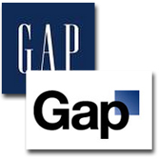
Clothing retailer Gap Inc. has scrapped a new logo amid an online backlash against the new design and a decision to abandon the company’s iconic white lettering inside a blue square.
"We’ve been listening to and watching all of the comments this past week," said a statement from Gap corporate communications attributed to Marka Hansen, president of the brand for North America. "We heard them say over and over again they are passionate about our blue box logo, and they want it back. So we’ve made the decision to do just that – we will bring it back across all channels."
The decision came Oct. 11 and followed the company’s initial response to the criticism Oct. 6, in which it asked for user-created submissions.
Hansen penned an op-ed in the Huffington Post on Oct. 7 in an attempt to "explain the thinking" behind the change of the 20-year-old logo.
"We chose [the new] design as it's more contemporary and current," she explained. "It honors our heritage through the blue box while still taking it forward."
The company said Monday that it has "learned a lot" through the episode, including that it missed the opportunity to engage with the online community.
"This wasn’t the right project at the right time for crowd sourcing," said the statement. "There may be a time to evolve our logo, but if and when that time comes, we’ll handle it in a different way."
The logo, created by New York agency Laird & Partners, was intended to be a long-term commitment for the brand with a nod to the future.
|