
 |
| Michelle Maggs |
Wrap your head around this: 2.5 quintillion bytes of data are produced by humans every day. A quintillion has 18 zeroes in it. 18! With that amount of information flying around, there’s no limit to the number of stories we as communicators can share by extracting interesting data nuggets.
We’re currently seeing a surge of data-driven storytelling in the media: outlets like The Economist, The New York Times and The Washington Post have dedicated data teams because data-led stories drive readership. We’re also seeing it with our clients: marketing, communications and analytics teams are collaborating to identify compelling data-fueled stories that engage audiences and drive brand awareness.
Clients often ask us where to start, so here are three critical steps:
Start with the story
As with all communications, it begins with the story. Sometimes clients ask for an infographic. Sure, an infographic might be the most relevant execution to communicate something, but we can’t afford to bypass strategy and old-fashioned storytelling best practices.
| This article is featured in O'Dwyer's Nov. '20 Technology PR Magazine (view PDF version) |
First ask the fundamental questions: what are we trying to communicate, to whom and most importantly why? Examine the broader business, economic, technological or cultural context and understand what your audience cares about. We also must consider what you as a business care about. Where those elements overlap is the story you want to tell.
Identify the proper data source
Armed with that story idea in mind, you can begin to think about the data needed grab the audience’s attention while also supporting the key messages you want to convey. Data can be extracted from myriad sources: internal datasets, external platforms, social media conversations, media coverage analyses, quantitative surveys, audience engagement figures, the list goes on and on.
With the story hypothesis defined, you can determine whether you have the proper datasets internally, whether they are available within the public domain, or whether you need to create a bespoke piece of quantitative or qualitative research.
If you’re creating research, remember that to ensure you get pithy, cut-through findings, your skills as a communicator are essential throughout the process. This includes everything from designing the research to actually going through the raw data set. Engaging a team of data experts, communications experts and marketing leads ensures you have the perspectives you need to confidently and effectively tell the stories you want to tell. Often when you’re presented with a dataset, it’s easy to become overwhelmed. Don’t be. Sometimes a compelling story—or even an entire campaign—can be built around one or two stats.
Create a compelling visualization
Next comes the fun part: visualization of the images that will bring the data to life. There are some incredibly powerful data visualizations out there: coronavirus, the aging population, every solar eclipse happening in your lifetime. But don’t feel intimidated. Compelling visualizations can come in a variety of methods, and simple bar graphs and scatter plots can be as effective as interactive and immersive animated images.
Using data to communicate COVID-19’s impact on traffic
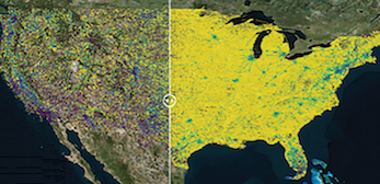 Example of INRIX data visualization shared with media; image on the left reflects the lower than usual traffic movement at the height of lockdown, while the image on the right shows the impact once lockdowns began lifting. Example of INRIX data visualization shared with media; image on the left reflects the lower than usual traffic movement at the height of lockdown, while the image on the right shows the impact once lockdowns began lifting. |
We’ve been fortunate to work with our client INRIX, a leader in transportation and mobility intelligence, for many years. Due to the inherent nature of the INRIX business, it has access to an abundance of data analytics of value to governments, businesses and consumers alike: everything from real-time traffic and parking information and solutions, signal and roadway analytics, traffic speeds and volumes and more.
As the penetration of COVID-19 began to increase across the United States, INRIX recognized an opportunity to share compelling insights into how mobility behaviors were shifting due to the pandemic. Together, we worked with INRIX on a series of reports on congestion trends across the country, looking at the data trends, identifying the most newsworthy and relevant angles, and distributing stunning visualizations of the analytics to media over the course of six weeks.
The weekly U.S. national traffic volume reports became “must reads” for reporters already covering mobility, transportation and infrastructure, and they extended the reach and relevance of INRIX to new media contacts and audiences in every major business, technology, trade and daily news organization in the country.
As a result, INRIX transportation analysts have participated in more than 100+ local and national media interviews, INRIX data has been referenced and its analysts quoted in hundreds of articles, and the heightened brand exposure has had a direct effect on lead generation growth and sales.
Data is a powerful aid when it comes to communications. From the initial strategic approach to designing the visualization and ultimately distributing the data-driven story through earned or owned channels, we’re helping clients maximize this opportunity.
Is this your moment to explore data-driven storytelling? We’re ready to help.
***
Michelle Maggs is Executive Vice President and Global Technology Lead at Current Global.

 Laura Anderson, who rose to VP/GM of global communications and events in a nearly 20 year stint at Intel, will take on the Americas technology chair at Burson following the completion of the BCW and H+K merger on July 1.
 WE Communications has partnered with ROKK Solutions to form the WE ROKK AI service.
 In the dynamic world of modern business, effective communication is a pivotal tool for success across various industries. At Communications Strategy Group (CSG®), our expertise in embracing innovation in communication extends beyond traditional marketing strategies, paving the way for transformative industry-specific solutions.
 There are two types of tech PR professionals. Which one are you? And are C-suite executives making that decision for you?
 While there’s an impulse to grab reporters’ attention with the newest industry-transforming tech product or service, a back-to-basics approach focused on telling the right stories to the right people is a far more successful way to ensure your technology campaign breaks through the clutter of today’s crowded tech landscape.


 Have a comment? Send it to
No comments have been submitted for this story yet.